The Importance of Colour Theory in Furniture
When it comes to choosing furniture, most people focus on comfort, quality, or style—but colour plays just as big of a role in how your home feels. Colour theory helps explain why certain shades work well together, how they affect your mood, and how they influence the overall harmony of a room. Understanding these basics makes shopping for furniture a lot easier—and more enjoyable.
1. Colour Shapes Emotion
Every colour carries an emotional weight. Warm tones like reds, oranges, and yellows bring energy, vibrancy, and coziness, making them great for gathering spaces like living rooms or dining rooms. Cool tones like blues, greens, and greys create calm and relaxation, ideal for bedrooms or quiet corners. Neutral colours—beige, taupe, white—bring balance and versatility, acting as the foundation of many home designs.
2. Balance and Contrast
Colour theory isn’t just about picking your favourite shade—it’s about creating balance. Too much of one colour can feel overwhelming, while thoughtful contrasts add depth. For example, pairing a bold accent chair in a deep navy with a light, neutral sofa creates visual interest without feeling chaotic.
3. Size and Space Perception
Colour also changes how we perceive space. Lighter colours can make a small room feel larger and more open, while darker tones bring intimacy and warmth to bigger spaces. Furniture colours play a huge role in this—choosing a light-coloured sectional for a compact living room can completely change the feel of the space.
4. Creating Flow in Your Home
When colours connect from one room to the next, your home feels cohesive. That doesn’t mean every room needs to match—it means using complementary tones that work well together. A dining set in a natural wood finish can flow beautifully into a living room with earthy accent chairs and a neutral sofa.
5. Personal Style Meets Practicality
Colour theory also helps blend personal taste with long-term practicality. A bright orange sofa might be fun, but will you love it five years from now? Using colour intentionally—such as adding vibrancy with pillows, rugs, or accent chairs—lets you enjoy personality without overwhelming the space.
Experimenting with Colour Theory - Bring Life to Your Living Space
Colour Harmony & Schemes in Furniture Selection
Choosing the right furniture for a space goes beyond individual colour preferences—it requires an understanding of colour harmony to create a balanced, visually appealing, and functional environment. Colour schemes help guide furniture choices so that different pieces work together harmoniously while complementing the overall aesthetic of a room.
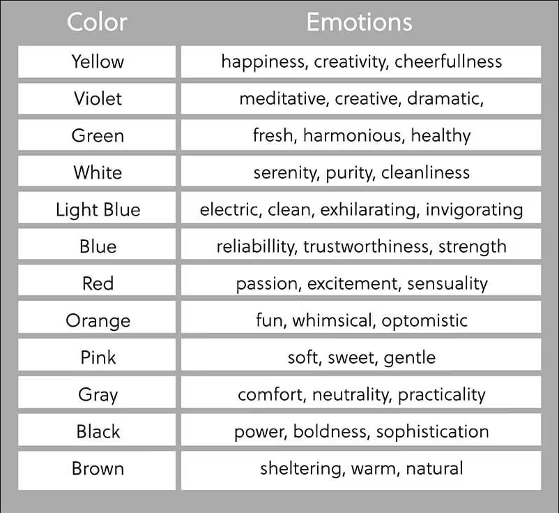
What is Colour Theory?
 |
Colour theory is a framework used to understand how colours interact with each other and how they can be combined to create certain effects or moods.It explores the relationships between primary, secondary, and tertiary colours, as well as concepts like complementary, analogous, and triadic colour schemes. By understanding colour theory, you can create more visually appealing and harmonious designs, whether for art, interior design, or branding. The theory also helps in choosing colours that evoke specific emotions, making it a powerful tool for communication and aesthetics. |
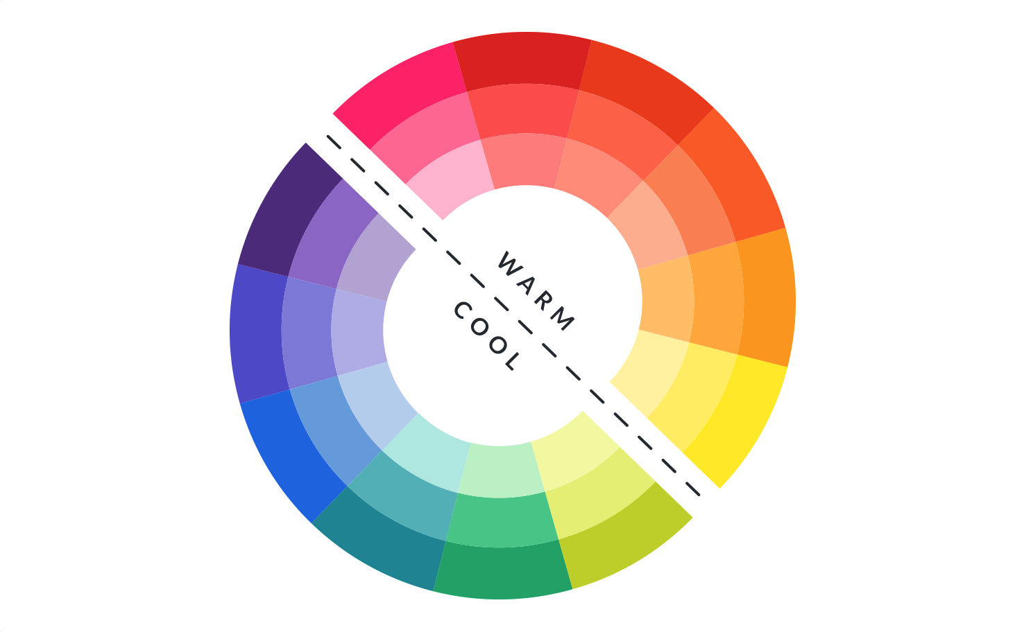
Warm vs Cold colours
Warm colours, such as reds, oranges, and yellows, are often associated with feelings of energy, coziness, and warmth.These tones can create inviting, dynamic spaces, making them great for areas where you want to encourage socializing or warmth, like living rooms or dining areas. Cool colours, like blues, greens, and purples, evoke a sense of calm, relaxation, and spaciousness.These colours are perfect for creating serene, peaceful environments, such as bedrooms or bathrooms, where you want to unwind and feel at ease. By thoughtfully mixing warm and cool colours, you can set the mood and function of any room in your home. |
Combining warm and cool colours allows you to tailor the atmosphere of your space, creating a balanced environment that reflects your desired mood. By thoughtfully blending these hues, you can energize certain areas while promoting calmness in others, helping to craft a space that feels dynamic yet harmonious. |

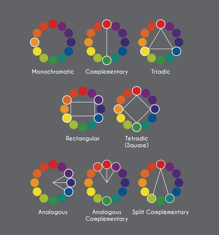
Complementary Colour Scheme
High Contrast & Bold Impact
Definition: Uses two colours that are opposite each other on the colour wheel (e.g., blue and orange, red and green, yellow and purple).
Effect: High contrast, energetic, and visually striking.
Best for: Statement pieces, modern or eclectic interiors, and bold, dynamic spaces.
This works well when one colour is dominant while the other serves as an accent (e.g., a neutral room with bold pops of complementary hues).
Think along these lines:
- A navy blue sofa paired with burnt orange throw pillows or an accent chair creates a striking and modern contrast.
- A rich wood or charcoal dining table with vibrant red or striking white chairs creates a dramatic, modern statement that’s both sleek and attention-grabbing.

Analogous Colour Scheme
Cohesive & Relaxing Aesthetic
Definition: Uses colours that sit next to each other on the colour wheel (e.g., blue, teal, and green; red, orange, and yellow).
Effect: Creates a smooth, natural flow with a calming effect.
Best for: Serene, cohesive interiors such as bedrooms, lounges, or spa-like environments.
Analogous colour schemes often use a mix of materials (e.g., wood, textiles, and metal) to add depth without overwhelming the space.
Think along these lines:
- A soft blue sofa, teal area rug, and green plants can create a cool, refreshing, and nature-inspired living space.
- Earthy tones like beige, terracotta, and warm brown can enhance a cozy and inviting bohemian or rustic setting.

Triadic Colour Scheme
Balanced & Playful Look
Definition: Uses three colours that are evenly spaced on the colour wheel (e.g., red, yellow, and blue or purple, green, and orange).
Effect: Vibrant, dynamic, yet balanced.
Best for: Playful, artistic, or eclectic interiors, as well as mid-century modern styles.
To prevent the space from looking overwhelming, use one dominant colour, with the other two as accents in textiles, artwork, or accessories.
Think along these lines:
- A mustard yellow chair, a navy blue sofa, and a burgundy coffee table can create a visually interesting yet balanced living room.
- Works well in children’s rooms, creative spaces, or retro-inspired interiors where a mix of bold hues adds energy and personality.

Monochromatic Colour Scheme
Elegant & Timeless Design
Definition: Uses different shades, tints, and tones of a single colour (e.g., various shades of grey, beige, or blue).
Effect: Sophisticated, minimalist, and calming.
Best for: Modern, Scandinavian, or high-end luxury interiors.
Different materials and textures (e.g., velvet, leather, wood, and metal) prevent a monochromatic space from feeling flat.
Think along these lines:
- A charcoal grey sofa, light grey armchairs, and a black coffee table create a sleek, modern space with depth and texture.
- A beige bed frame, tan bedding, and soft cream rugs result in a cozy, neutral-toned bedroom with warmth.
|
|
Colours have the power to evoke specific emotions and set the tone of a space.Understanding how different hues impact mood can help create an environment that reflects your style and enhances the desired atmosphere. By selecting colours that align with your intended emotional vibe, you can transform your furniture choices into a harmonious, inviting setting. |